This project serves as a redesign concept for the official Spotify® website. At the time of the project, the main goal was to create a shift towards a more simple and clean looking identity, while staying true to the brand's main values.
Before hopping into the redesigned screens, I'd like to mention some of the aspects I took into account before starting the project.
🙁
Visual cohesiveness
At a first glance the brand's identity is a bit all over the place. It's something you can sense just by casually browsing the current website. You will notice quite a variety of background styles (besides other aspects) throughout the pages, the downside is that it does not seem intended at all.
😢
Iconography
Let's say you check out their Premium offering and then decide to download the official app. That's just how long it takes to notice some unlikeness between some of the icons currently in use.
😭
Components
While I'm sure both pages serve their purpose just well, I can't help but notice the many differences between the two. Starting with the input fields, the overall color scheme, button styles, and so on. These aspects just add up to the on-going list of discrepancies.
CONCLUSION
Consistency should be prioritized.
That being said, I started this project motivated to burry some of these issues and bring some well deserved charm and consistency to the Spotify® website.
A CHANGE FOR THE BETTER
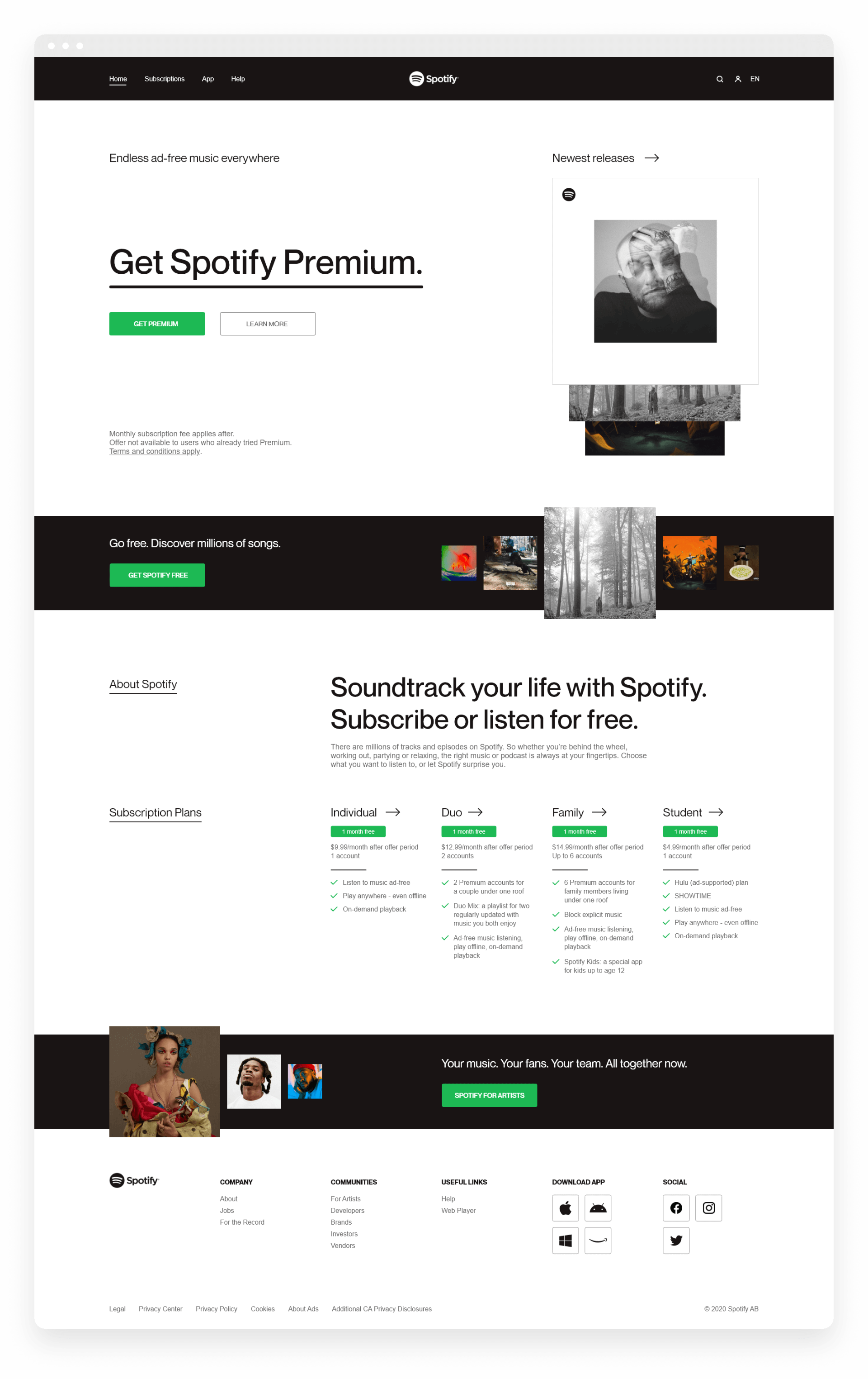
Now, I invite you to have a look at the UI overhaul I came up with. One that's focused around solving the issues pointed out earlier in the page.
If you don't feel like continuously scrolling throughout the page, then please check the individual pages by clicking on the links below.
You now have all the essential pages on the left side, while user centered actions are now placed on the right side of the menu.
A website wide search function is now in place, so you can easily find your way around.
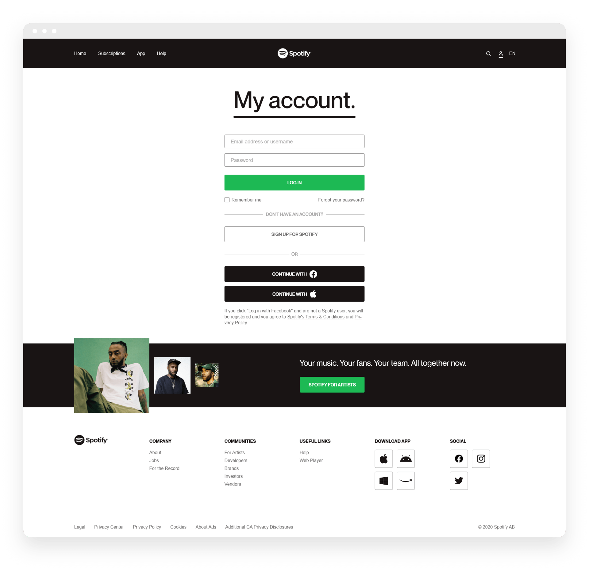
Register, login and manage your account through one simple unified page.
Quickly change your region based on your preferences.
2ND SCREEN
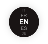
Subscriptions
HIGHLIGHTS
A cohesive icon set
The new icons might seem a bit too basic at a first glance, although that's exactly the desired direction here. Simplicity and cohesiveness achieved through simple thin flat lines.
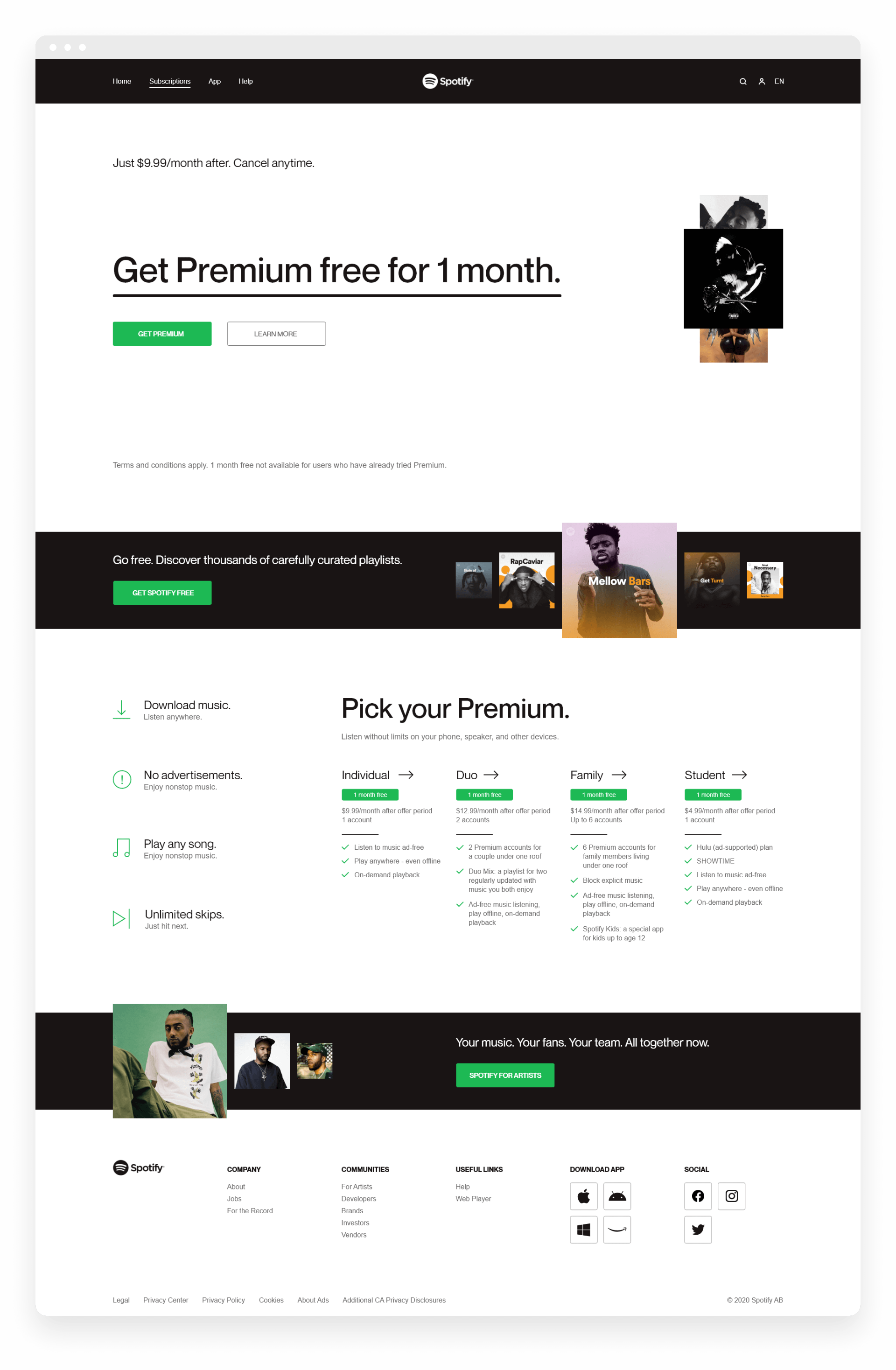
3RD SCREEN
App
HIGHLIGHTS
Visual set-up
Powerful contrast, bold copy and album art emphasis. That's the standard set up you'll notice throughout the redesigned pages, mixing all these together creates a beautiful, simple and impactful experience.
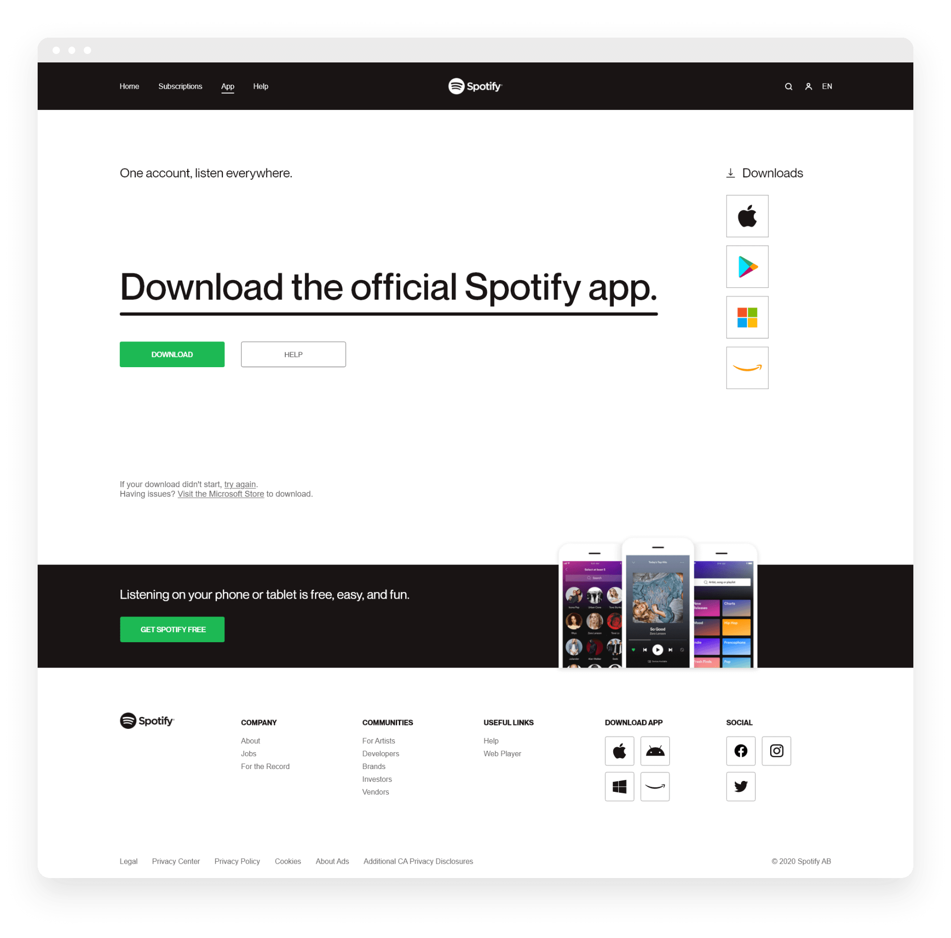
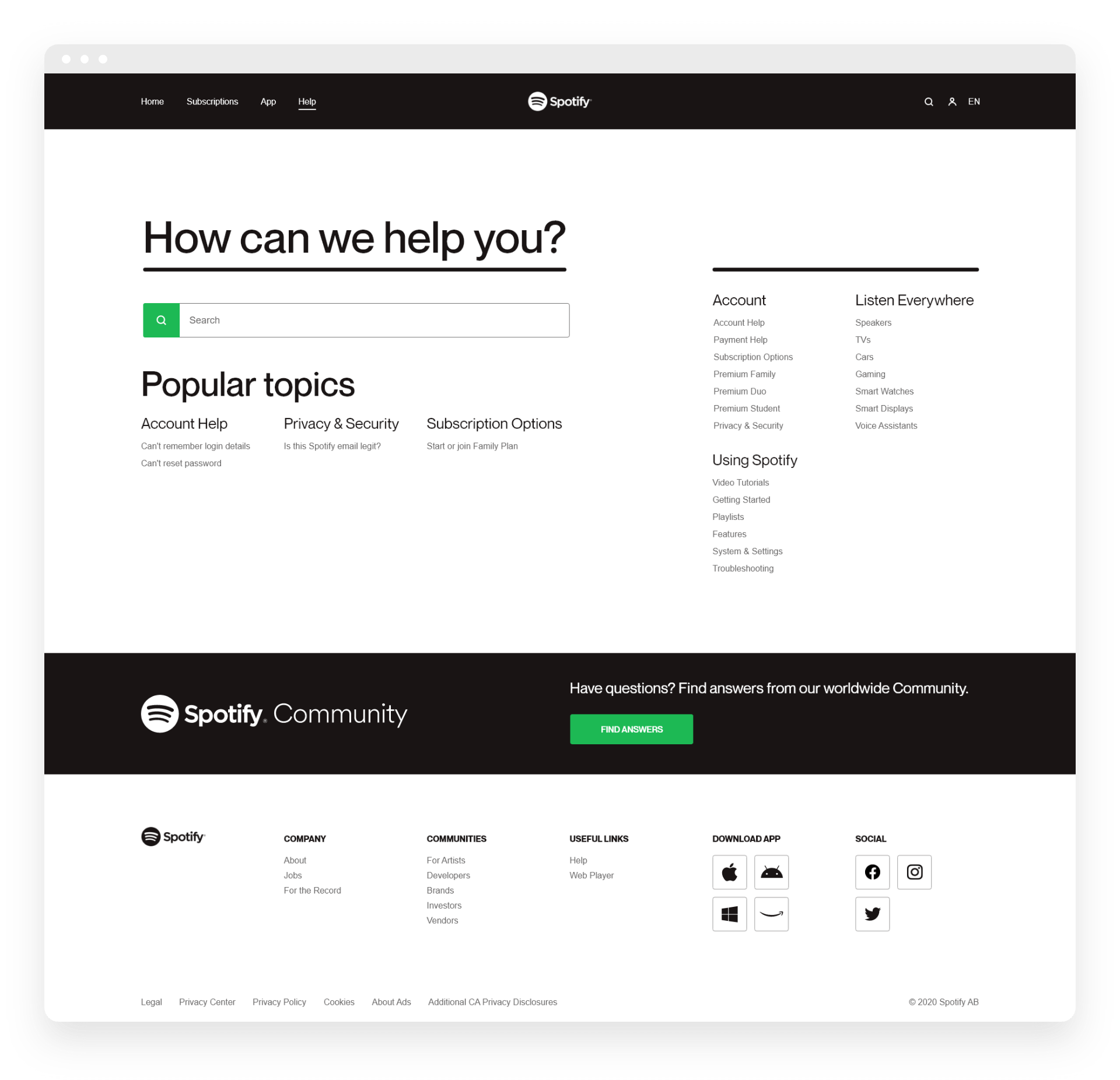
4TH SCREEN
Help
5TH SCREEN
My account
FINAL THOUGHTS
I'm very appreciative if you've made it this far.
I honestly found this project to be a good exercise. It allowed me to identify some issues, think of and test possible solutions, while also having the absolute freedom to shape up most visual aspects just as I desire.
Looking back at it, of course I would've done some things differently. Perhaps I'll get to revisit this project and improve it further at a later point.
Lastly, side projects (such as this one) are extremely fun to work on, but can also be considered stupid to a certain extend, I think that's just the charm of it though.