At a first glance, the implementation of the brand identity in the digital realm is disorganized and inconsistent.
It’s an aspect that can be easily observed by casually browsing the current website. No common structure can be identified between multiple pages, and that can translate in users being less tolerant of possible technical or usability related issues.
The iconography style is very different throughout the website.
It’s a pretty obvious misalignment, that can be easily noticed on a first visit. I was able to identify three different styles just by casually browsing from one page to another, in less than a couple of minutes.
The current implementation is filled with different variants of a single component, and multiple foundation related values.
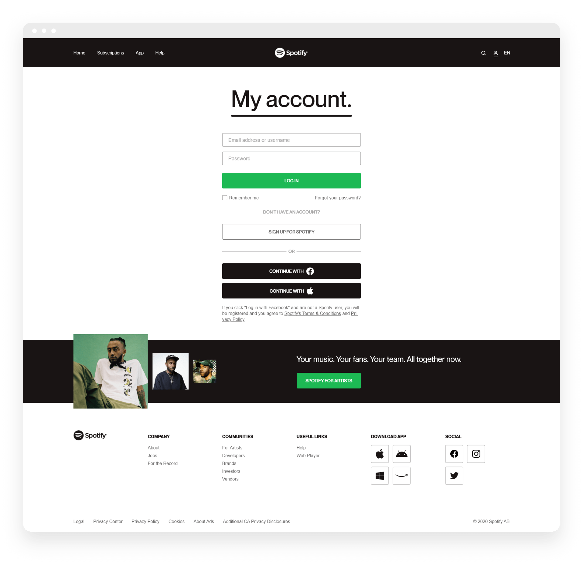
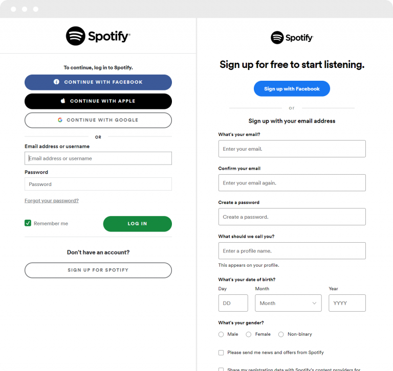
The log in and register pages are two very similar entries. You’d expect these to not look very different, but that’s not the case here.
Unfortunately, there’s a lot of inconsistency between the two. Starting from the input fields, to the overall color scheme, button styles, and so on. All these aspects just add up to the on-going list of discrepancies.
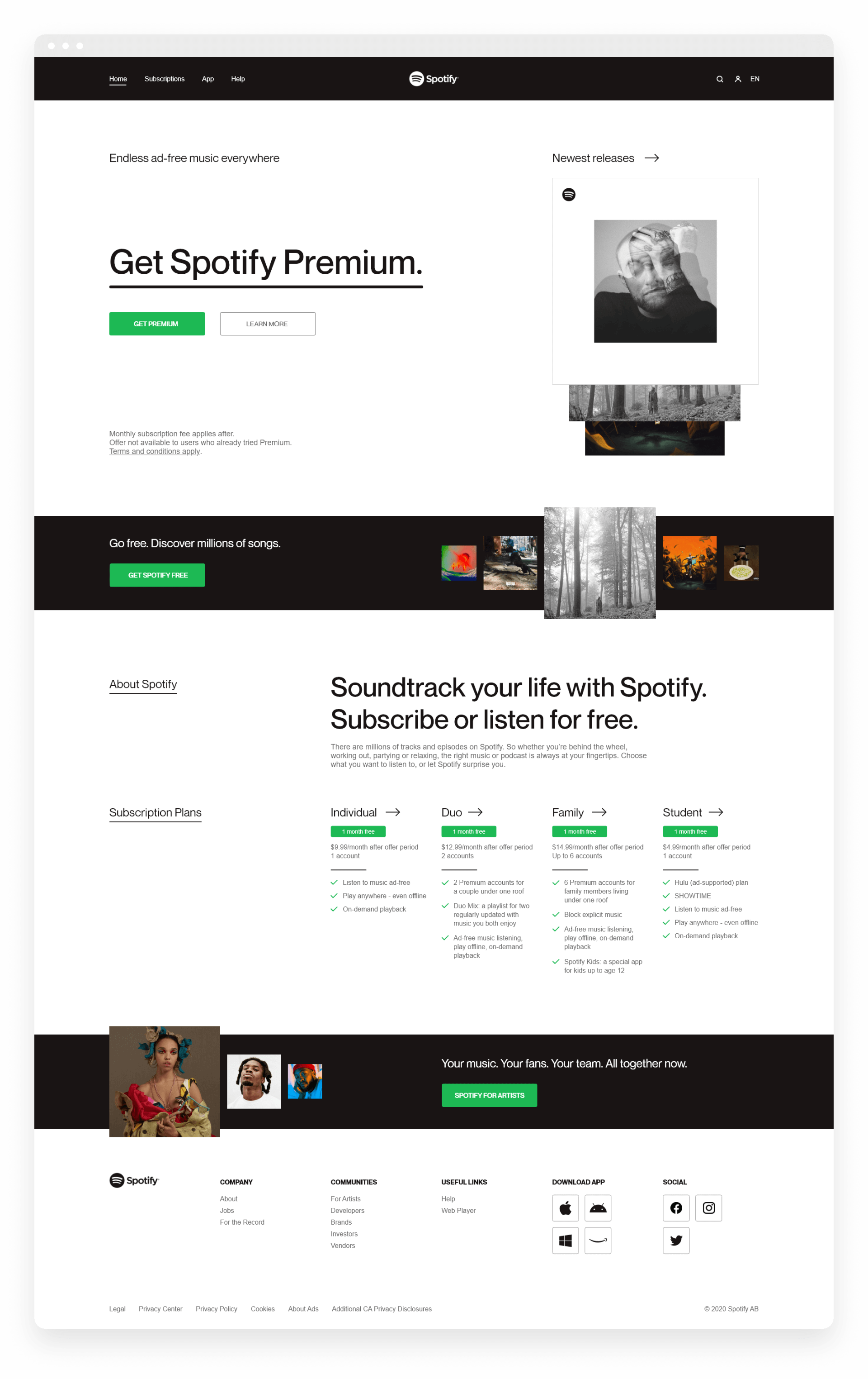
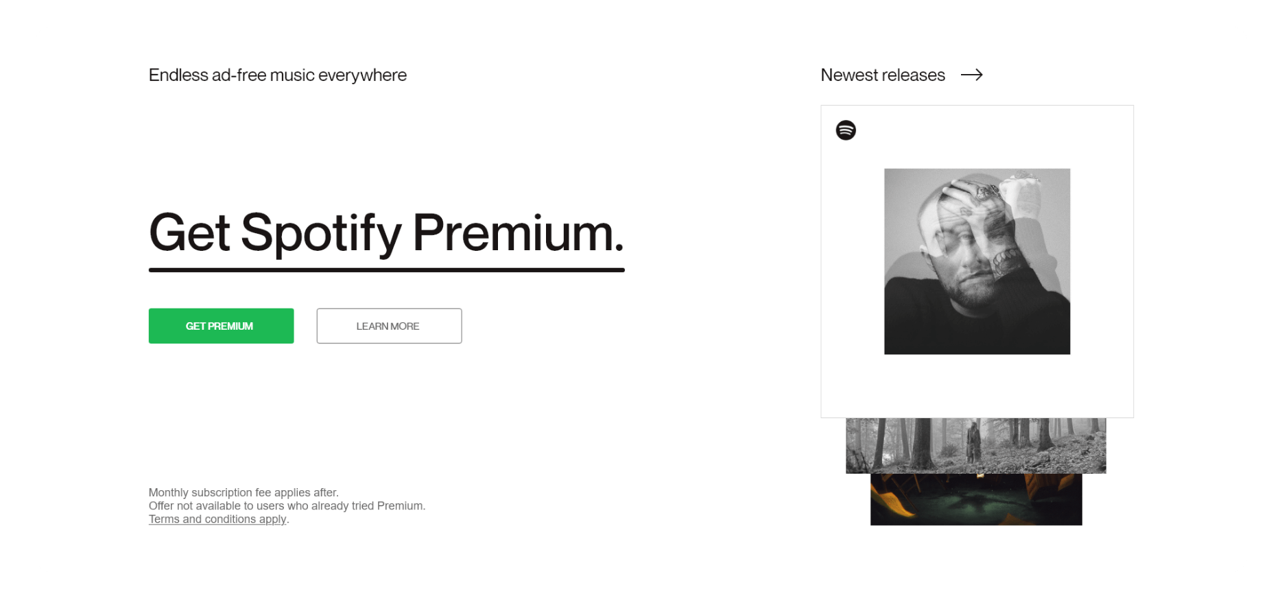
The home page redesign proposes a simple, accessible and clean visual approach, with high emphasis on all around consistency and usability.


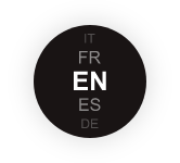
The redesign of the subscriptions page makes it more intuitive and user-friendly, with clearer descriptions of available plans, pricing options, and benefits.
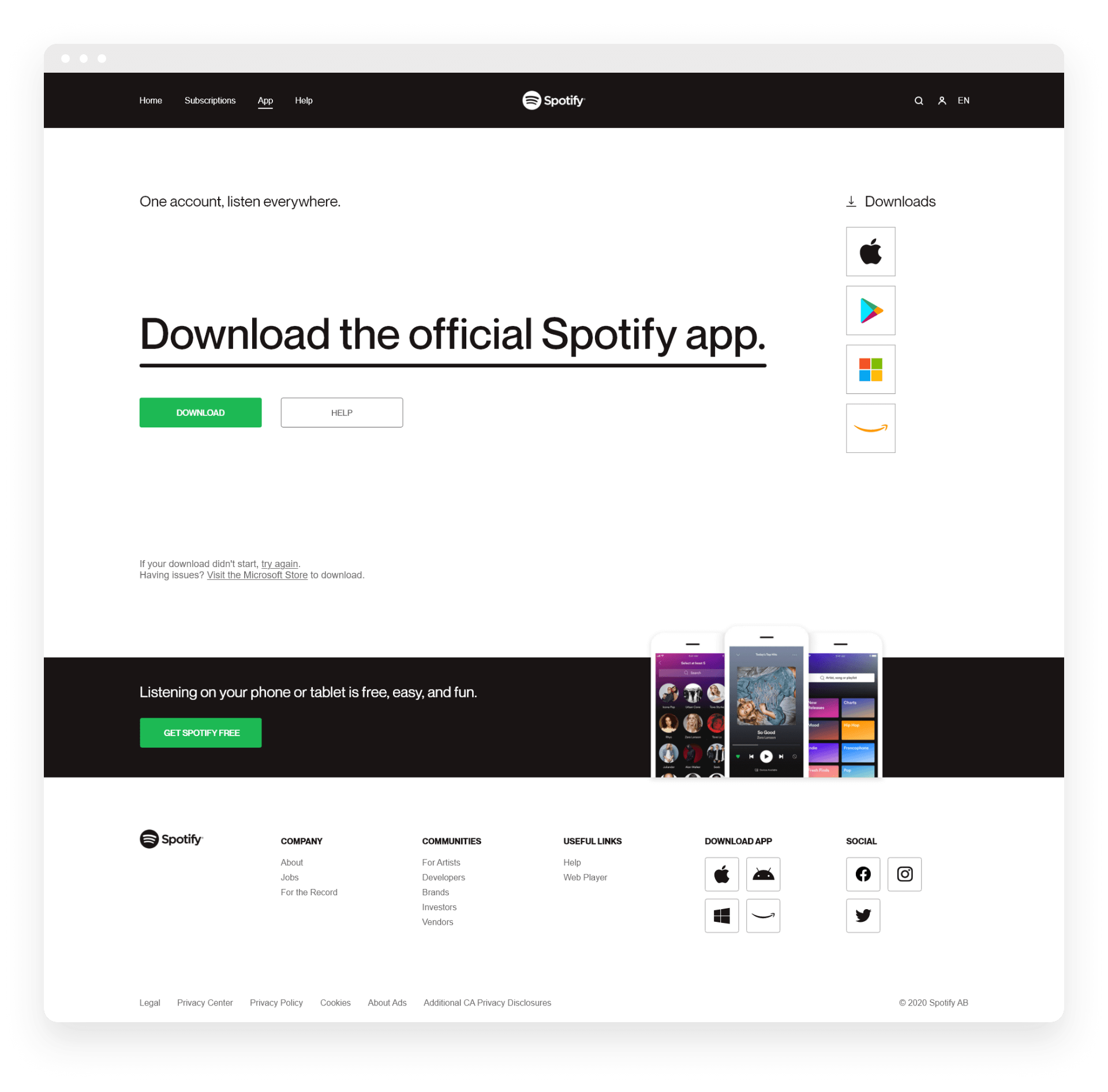
The redesign of the App page makes it more engaging and informative, with a clear and easy-to-use interface. The new design features more prominent calls-to-action, that allow users to download the app directly from the page or redirect them to the app store.
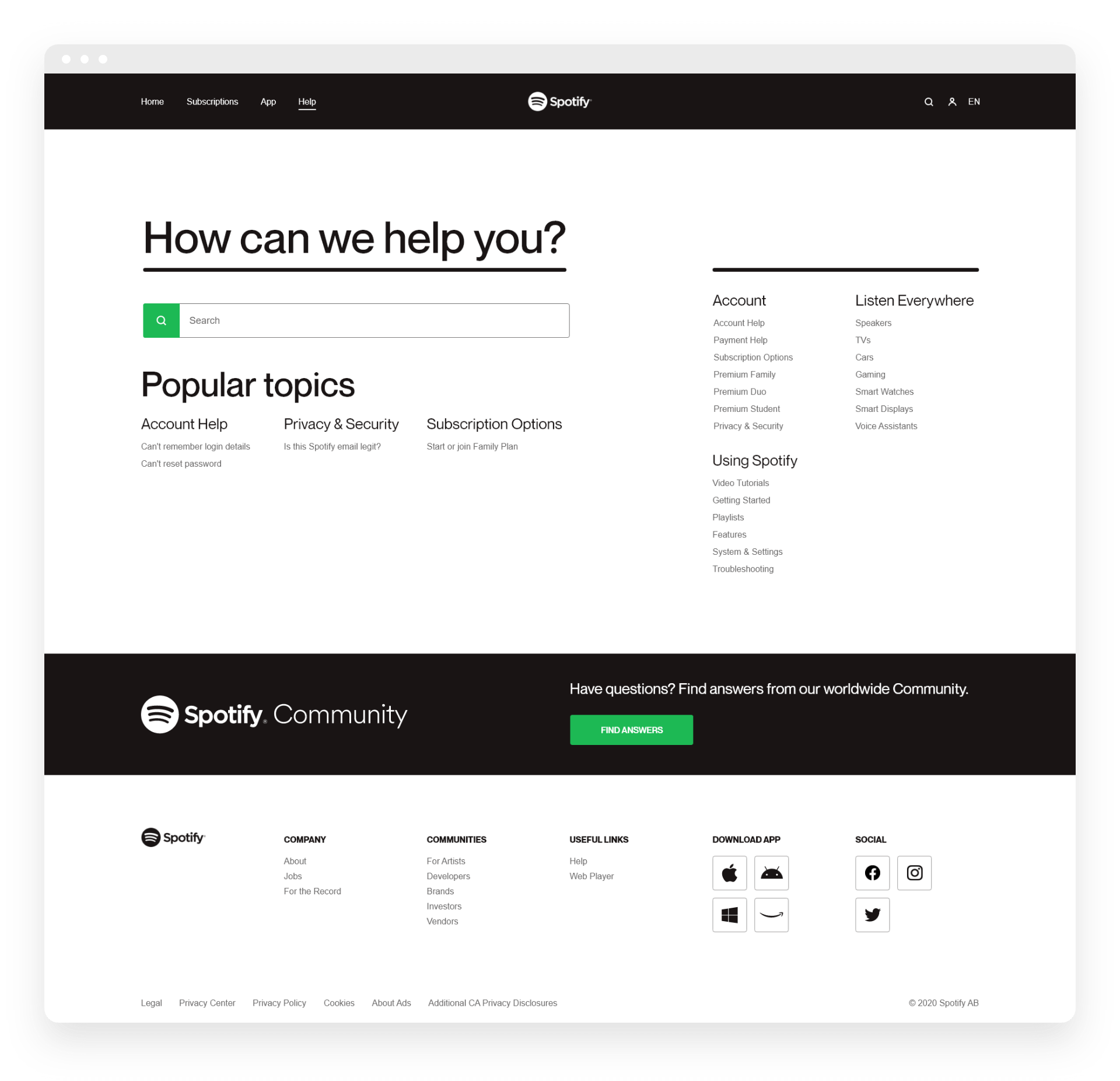
The redesign of the Help page makes it easier to find answers to common questions and issues by organizing the content into clear categories and using a search bar to quickly locate relevant topics.
The redesign of the My account page makes it more user-friendly and convenient, with a simplified layout that allows users to access and manage their account information with ease.