UI DESIGN

ROCKSTEADY GAMING

A gaming tournament platform

Earlier this year, I took on a design assignment with the objective of setting up a visual design language for a gaming related platform. Therefore, the whole process involved doing a short research, defining the visual identity and setting up the design system (including well defined components).

RESEARCH

Main takeaways

After carefully going through and processing the brief multiple times, I decided to write off three main points that I'd keep in mind during the entire duration of the project, so I don't distance myself too much from what was initially requested.

COMPELLING DESIGN

“...develop an online gaming experience with a compelling design”

DOCUMENT EVERYTHING

“Document your creative process so we get an understanding of how you got to the final result”

BENEFITS

“Showcase how the platform would benefit from a design system...”

Research approach

In order to get myself better familiarized with the target audience and the way similar platforms operate, I have chosen to begin the research process through the following two methods:

  • User interview
  • Competitive analysis

As a side note - being a casual gamer myself, I have never used tournament platforms such as the one presented in the brief, and I was quite curious to learn more about the subject matter.

User interview

In order to get a better understanding on how these platforms operate and what's to be expected, I decided to interview a friend who's active in a more casual, low tier tournament scene.

Throughout the conversation, it stood out to me that visual expectations are not high from a user point of view. Although most of these platforms look dated, that doesn’t seem to be much of an issue for now, such products stood the test of time through consistency, brand recognition and trustworthiness. On the other hand, gaming related companies are constantly pushing forward and embracing more design changes that aim to enhance the overall UX/UI experience (the new Battle.net app is a pretty good example).

Therefore, even in this very moment, gamers are constantly becoming more aware of the shortcomings of such platforms just by using other well-designed products on a daily basis. Eventually, the desire to have an all around good user experience will make a real difference when it comes down to choosing one platform or another, and that’s exactly one of the reasons why design should be the foundation of all things.

Competitive analysis

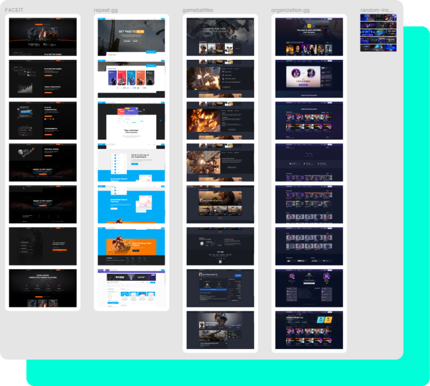
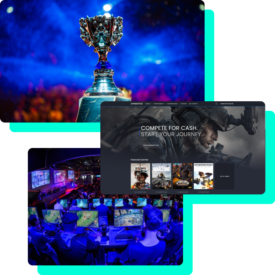
After some consideration, I picked four similar platforms and analyzed how these hold up UI wise – the good, the not so good, and what are some of the main aspects such products share, here’s what I found:

  • Dark themed platforms seem to be quite common, I think that’s an aspect of value right here, gaming related platforms should be suitable for low-light environments.
  • Landing pages are not too visually crowded, USP’s are pretty straightforward and very well highlighted, high emphasis on video games media content (screenshots, brand colors, specific game logos) seems to be quite common.
  • I might have my own opinion regarding the overall dated UI direction, but most of these platforms look quite cohesive in general, and that’s always a very big plus.

Conclusion

Before diving deeper into the creative process, I must say that I now feel more confident towards the platform I want to shape up. Spending more time to get familiarized with similar products would be ideal, but there’s plenty of work ahead, so all this information will have to do for now, here’s a very quick recap ahead:

  • Most gamers prefer a dark themed platform because of the well-known benefits – reduced eye strain and low-light settings suitability.
  • Ideally, content should always be easy to read, contrasting, yet not too harsh on the eye. The color scheme will play a key role in this part.
  • Users are constantly becoming more aware of poorly designed gaming related products. My aim during this project is to create both a brand and platform that feels vibrant and fun, but also premium and trustworthy.

DESIGN PROCESS

Visual identity

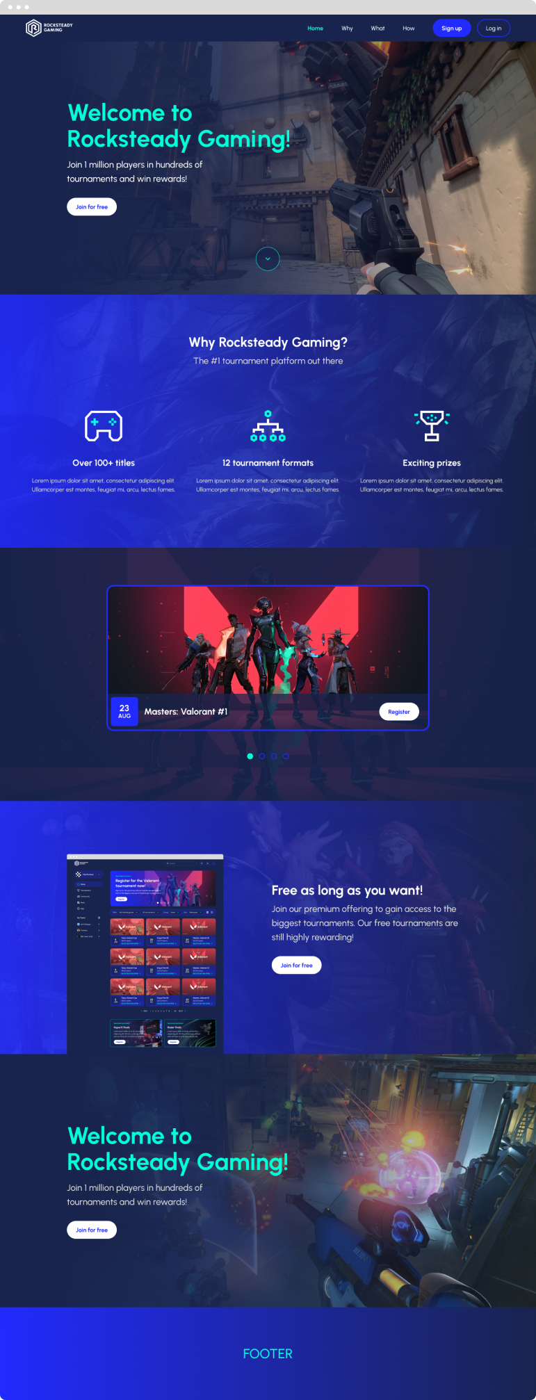
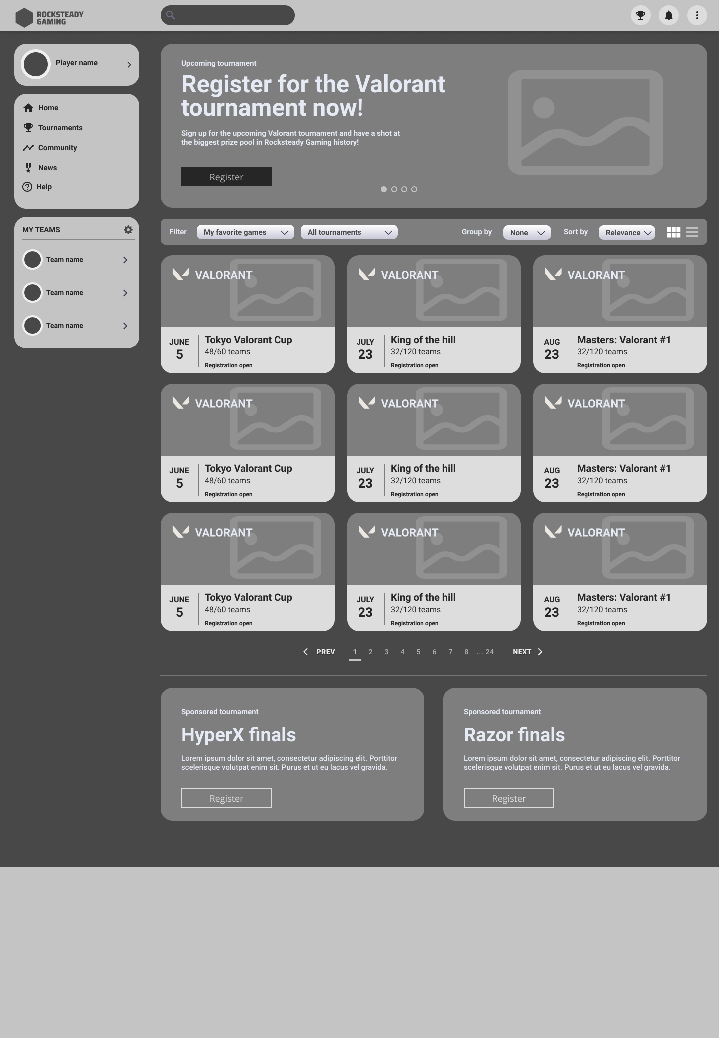
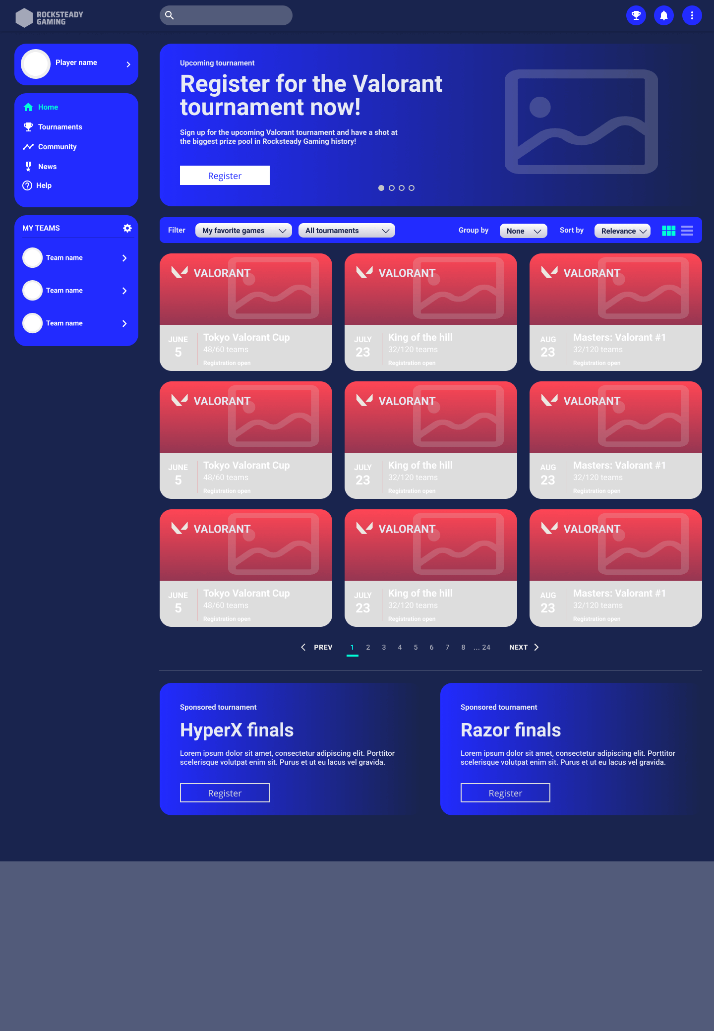
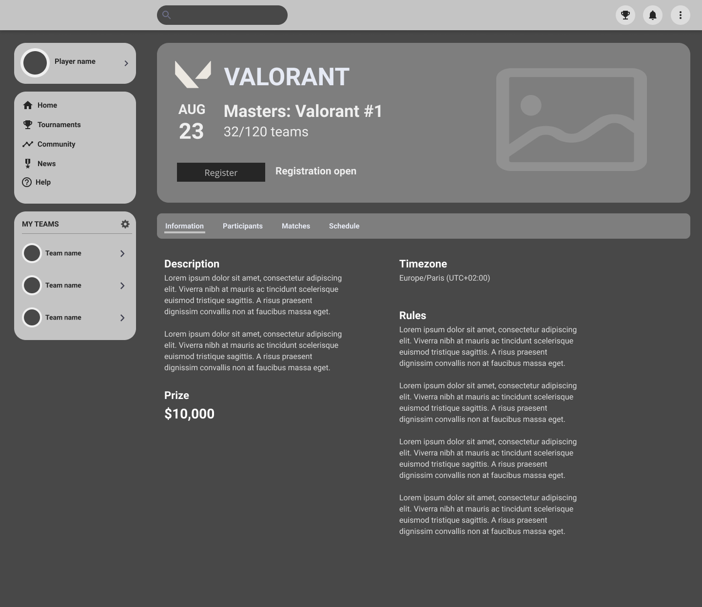
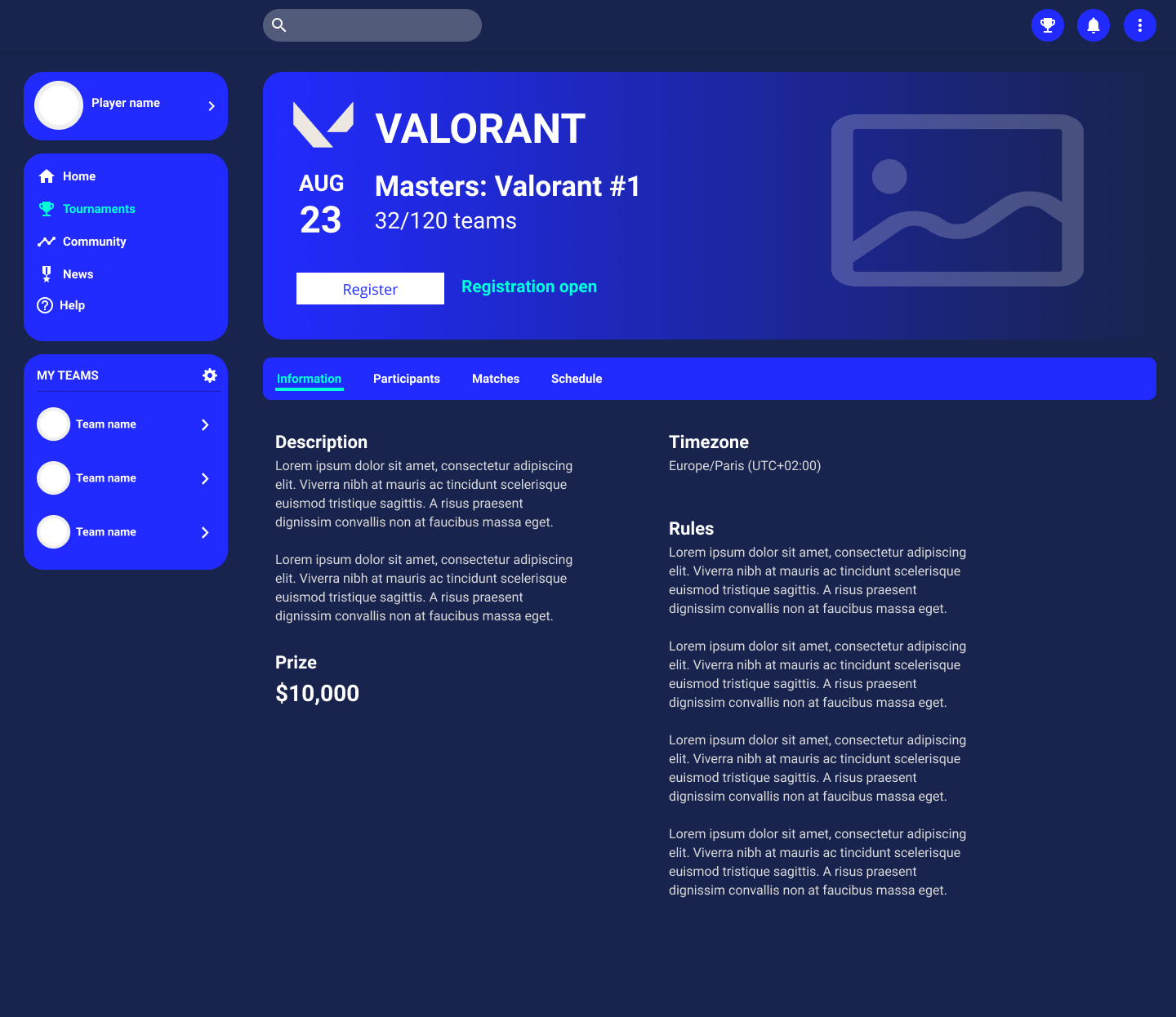
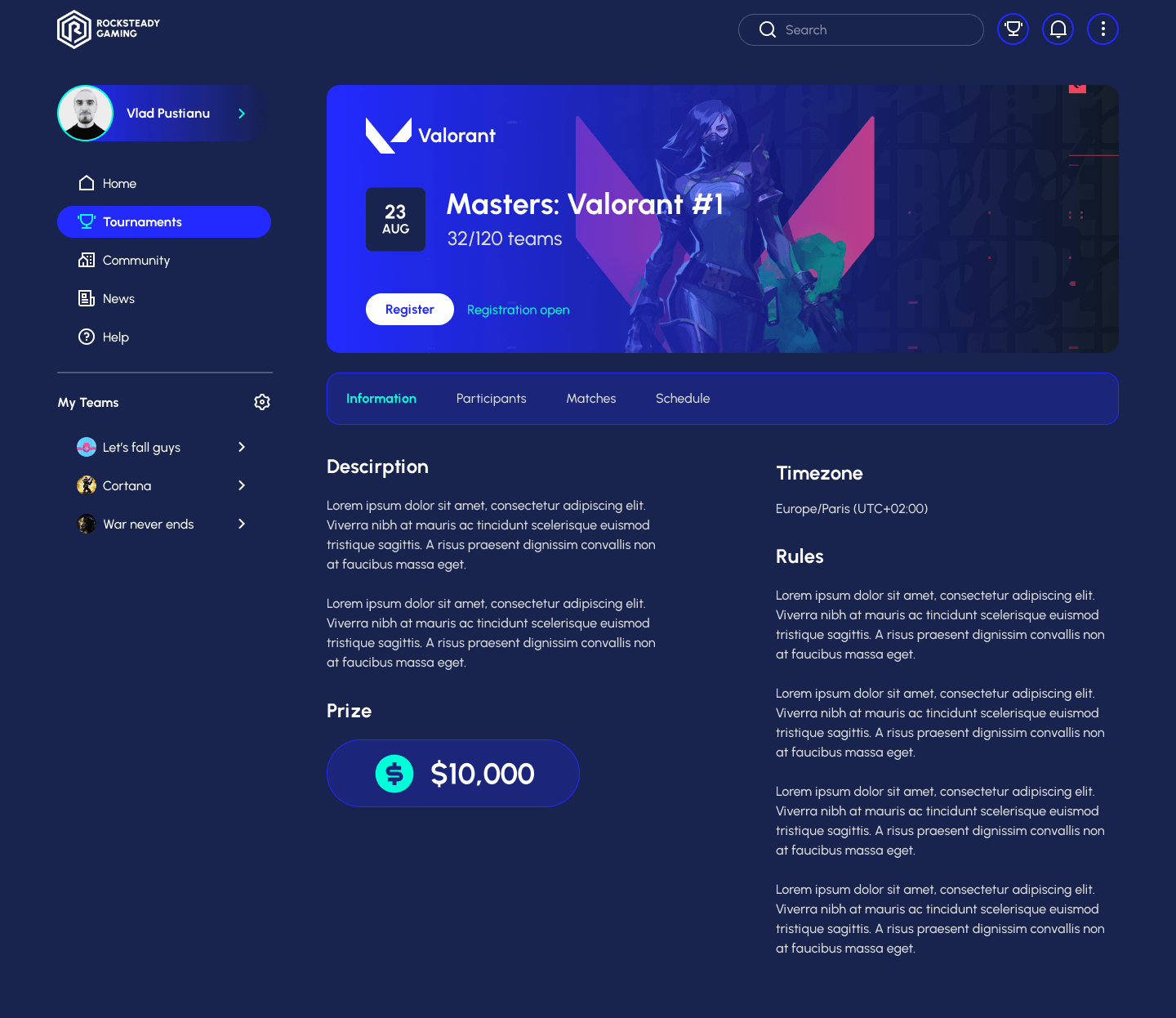
In order to get a better feeling of the project, I started at the very beginning of the process – defining the visual identity. This is a key aspect that will eventually translate into the entire UI later on.


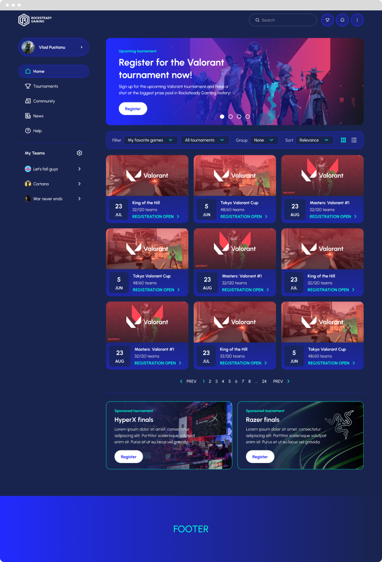
Therefore, I intended to create an identity that feels relatable and familiar to the brand’s target group. Since we are referring to a gaming related platform, I aimed for a bold visual identity – one that looks premium, fun and trustworthy.

DESIGN PROCESS

Design system

As far as Rocksteady Gaming goes, I started to build up the design system foundation right after wrapping up the visual identity. Naturally, the first steps involved setting up a grid system, defining various text and color styles, and putting together some essential assets.

Grid system

12 COLUMN GRID • 20PX GUTTER • 70PX MARGIN

Assets and styles

Iconography

Remix Icon Library • Custom build icons

12 COLUMN GRID • 20PX GUTTER • 70PX MARGIN

Components library

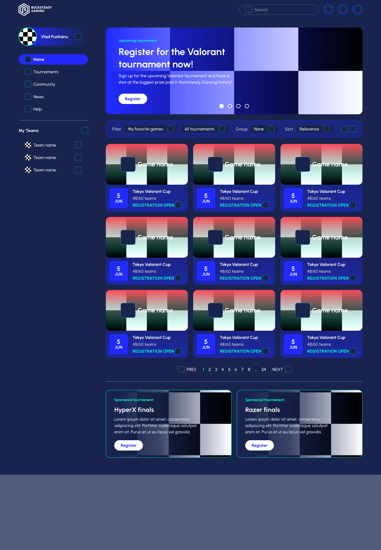
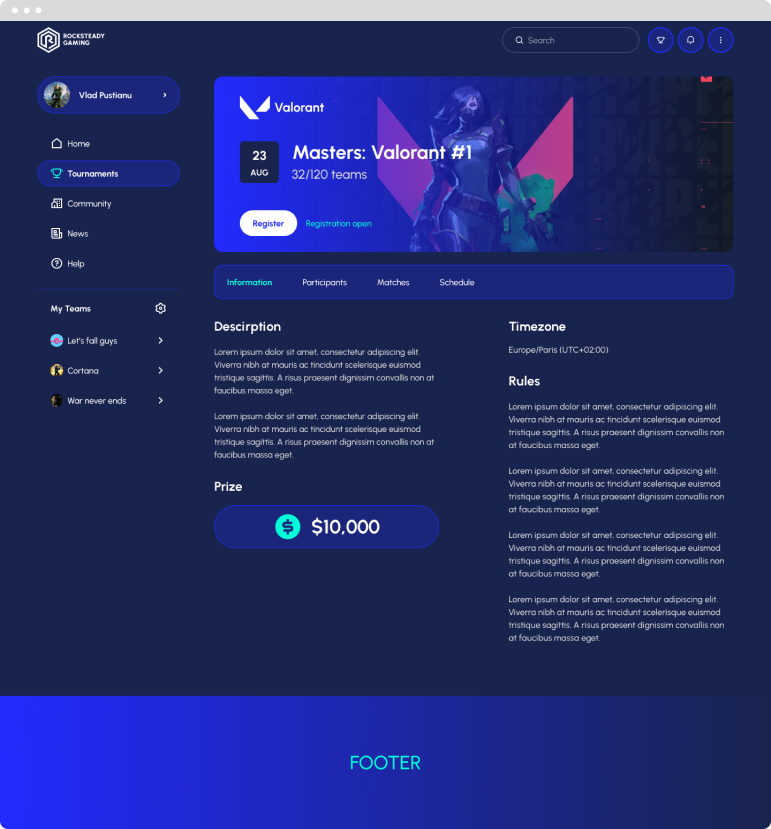
The components for this project were built and set up per specific categories, as some of these can only be found on certain pages. As it is already commonly known, keeping things organized is an essential aspect when building or updating a design system at any scale. As designers, this makes our day to day work so much easier and provides massive help in building a consistent, ever-evolving product.

DESIGN PROCESS​

Landing Page

WIREFRAME

1ST PHASE

2ND PHASE

The #1 esports tournament platform in the world. Join 1 million players in hundreds of tournaments, outplay the opponents and win big prizes.

DESIGN PROCESS​

Start Page

WIREFRAME

1ST PHASE

2ND PHASE

Free as long as you want. You can also join our premium offering in order to gain access to bigger tournaments and larger prizes. Our free tournaments are still highly rewarding and just as challenging!

DESIGN PROCESS​

Tournament Page

WIREFRAME

1ST PHASE

2ND PHASE

Sign up for any of the upcoming Valorant tournament and have a shot at some of the biggest prizes in Rocksteady Gaming history!

FINAL THOUGHTS

Thanks for sticking around

This assignment was definitely challenging, but it also proved to be a nice learning experience. It allowed me to further polish my design approach and work in a more structured manner.

In the end, I believe the UI represents what the platform was truly aiming for - the design feels vibrant and fun, but also trustworthy and premium. It's a product that respects the gamers and their needs, without being way over the top.

That being said, I'd be glad to discuss more about the project. There are, of course, a couple of doubts that I still have myself, so feel free to leave a message or contact me via email if you'd like to dive into those.