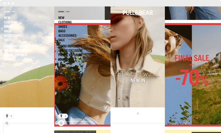
The mixed usage of campaign images and textual content poses a significant problem in terms of readability.
As a brand that caters to a youthful demographic, I firmly believe that relatable art direction can be executed in a manner that facilitates the proper highlighting of other crucial elements, such as headers, body text, and buttons. This will lead to an overall improvement in readability and usability.

Currently, it is not feasible to navigate through both men’s and women’s categories simultaneously.
One can only opt for one category at a time, leading to a page reload. Furthermore, the website’s unfamiliar layout in contrast to other e-commerce websites makes it less user-friendly and intuitive.
There are many potential improvements that could be made, but I have only addressed some of the more obvious ones that caught my attention.
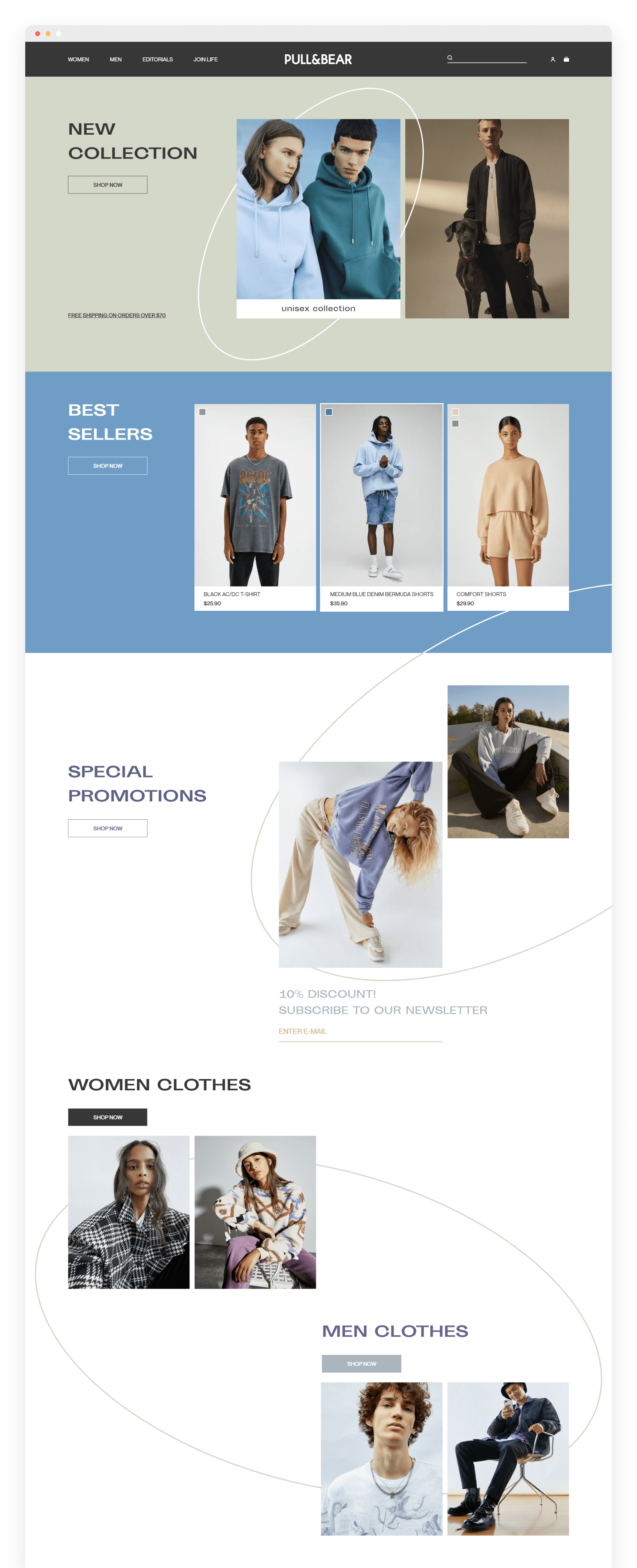
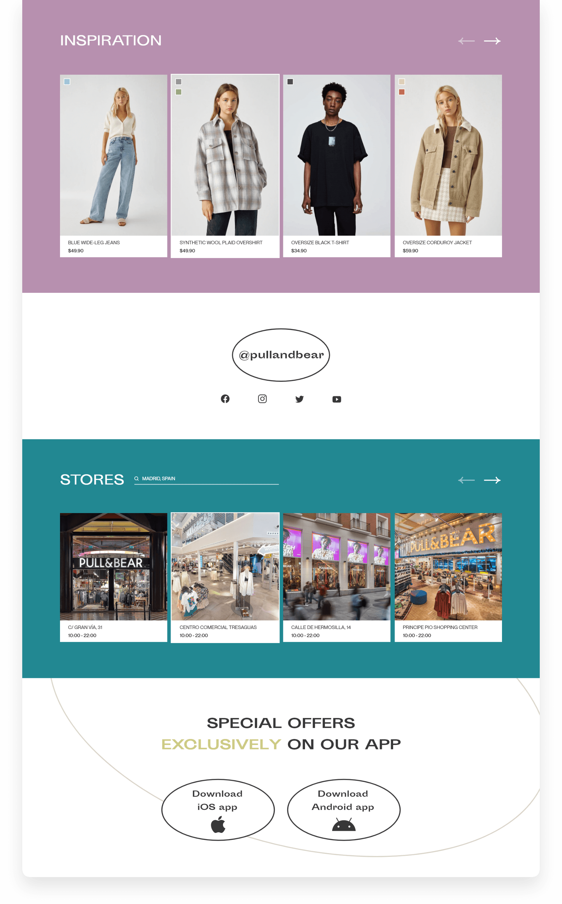
The primary focus was to propose workable solutions to the issues mentioned above, while still keeping the brand’s central values at the forefront.
Following further competitive analysis, sketching, and rapid wireframing, I arrived at the resulting design. The concept prioritizes simplicity, legibility, and user-friendliness, while retaining an overall art direction that resonates with young adults and teenagers.

